Why Consistent Brand Colours Matter
Creating a Unified Visual Identity Across Print and Digital
In branding, every detail contributes to how your audience perceives you, and colour is one of the most powerful tools in that arsenal. It's not just about making things look nice; it’s about creating recognition, building trust, and reinforcing emotion at every touchpoint.
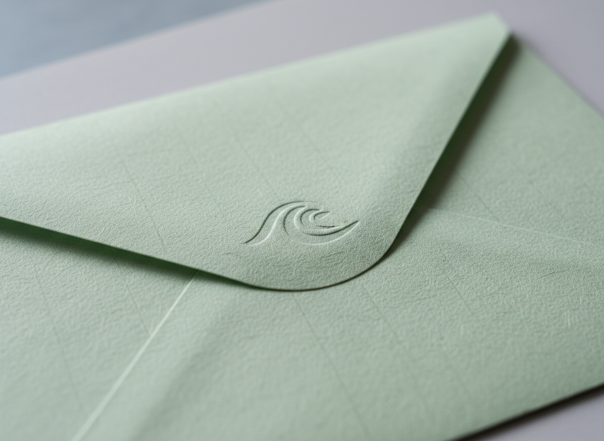
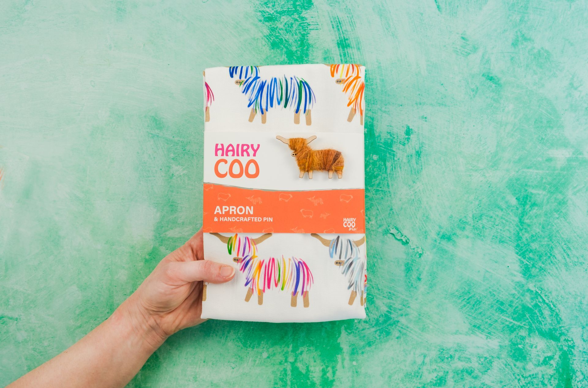
Whether you're designing packaging, brochures, signage, or social media graphics, maintaining colour consistency is key to a strong and memorable brand.
Colour Increases Brand Recognition by Up to 80%
A recent survey by marketing agency Reboot, found that a consistent colour palette can improve brand recognition by as much as 80%. Colour activates visual memory. When people see your brand’s colours repeatedly in print, online, or out in the world, they begin to associate those colours with your values, services, and personality.
Tiffany & Co.’s signature blue is a powerful example of colour branding done right. Instantly recognisable, this distinctive hue evokes elegance, exclusivity, and luxury. The shade, officially named “1837 Blue” by Pantone, honouring the year Tiffany & Co. was founded, is a custom colour created specifically for the brand. Though not publicly available, it is used consistently across all of Tiffany’s packaging, marketing materials, and promotional assets, reinforcing the brand’s identity at every touchpoint.
Colour Inconsistencies Undermine Trust and Professionalism
Inconsistent use of brand colours can compromise the perceived professionalism and credibility of a business. Even slight variations in tone or saturation can disrupt brand recognition and weaken customer trust. This is especially critical in industries such as finance, healthcare, and technology, where precision and reliability are expected.
For example, if a tech company distributes two promotional brochures, one in its standard brand colours and another in noticeably faded or mismatched tones, the inconsistency may suggest lapses in quality control. Such visual discrepancies, though seemingly minor, can impact a customer's perception of the brand's reliability and attention to detail.
Colour Triggers Emotion and Sets the Tone
Colour is psychological. It influences perception and evokes emotion before a single word is read. This is why designers carefully curate brand palettes to align with a company’s values and tone of voice.
For instance:
- Blue conveys trust, calm, and professionalism
- Red suggests energy, urgency, and passion
- Green implies health, sustainability, and growth
- Orange reflects warmth, creativity, and friendliness
However, if a brand’s “friendly orange” appears as a dull brown in print, or its calming blue skews purple under different lighting conditions, the intended message is compromised.
Inconsistent colour application can significantly impact how a brand is perceived emotionally, ultimately affecting trust and credibility. Maintaining colour consistency across all platforms, both digital and print, is essential for reinforcing brand identity and delivering a cohesive, recognisable experience.
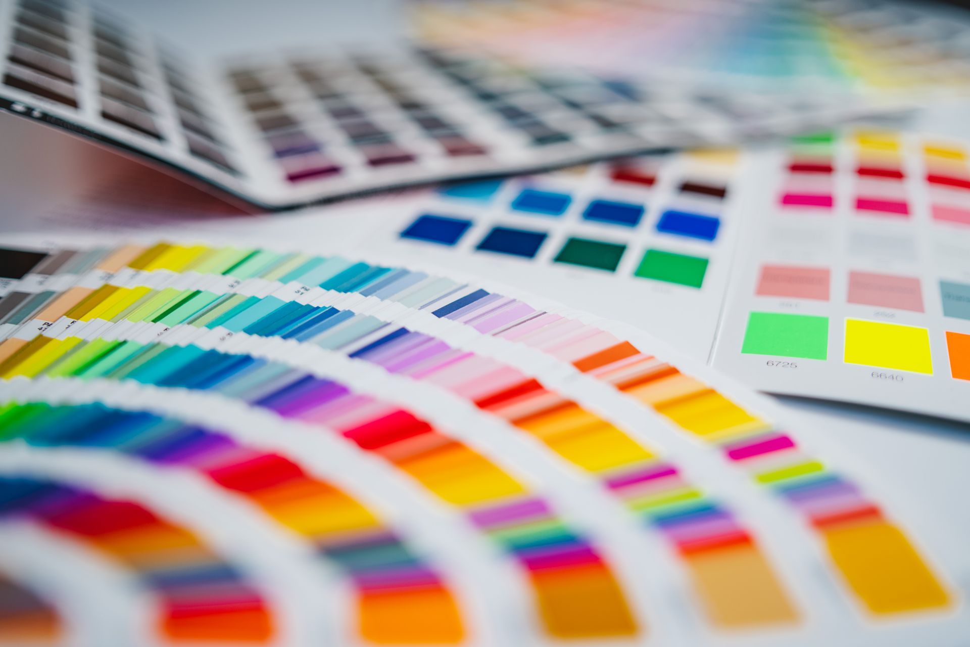
It is important to consider how colours translate from screen to print, as well as how they perform across different print runs. At Winter & Simpson, our high-quality lithographic printing presses enable precise colour matching and consistency, ensuring your brand always looks its best.
Colours Communicate Without Saying a Word
Visuals speak faster than text. Your brand’s colours create a visual identity that communicates your vibe, personality, and purpose even before someone reads your tagline.
When colours are used consistently:
- Your message becomes clearer and stronger
- You reduce confusion across platforms and media
- You build familiarity and brand recall
On the other hand, inconsistent colour use sends mixed signals. You might say you’re modern and bold, but if your brand colours vary from one material to the next, that message gets lost in translation.
Colours Help You Stand Out in a Crowded Market
In a competitive and visually saturated market, standing out is essential. Strategic use of colour can give your brand the edge it needs to capture attention and remain memorable.
Consider the following:
- On a crowded retail shelf, do your brand colours attract the eye?
- Among a wall of posters or exhibition stands, does your booth draw attention?
- In a busy inbox or social media feed, is your brand instantly recognisable?
How to Maintain Colour Consistency in Print
Maintaining colour consistency isn’t always easy, especially in print, where variations in paper stock, printer calibration, and lighting can all affect the final result.
Here are a few quick tips:
- Use brand guidelines with defined colour values (Pantone, CMYK, RGB, HEX)
- Always request print proofs before large print runs
- Choose coated papers for more accurate colour reproduction
- When possible, use the Pantone Matching System (PMS) for absolute precision
Final Thought: Don’t Just Select a Colour, Own It.
Consistent use of colour doesn't have to be limiting; it’s about creating recognition, trust, and emotional connection. Your brand’s colours serve as a powerful visual shorthand for meaning and recall.
Want more pro-level print and design tips?
Follow us for expert advice on making your brand look its best in print and beyond.